


The best D2C websites in India for 2026: 6 brand sites that get the phone right.
Most Indian shoppers meet a D2C brand on a phone, usually from an Instagram ad or a WhatsApp forward. The brands that grew fastest built their websites for that moment. Here are six standout ones, one per genre, with what each does well on a phone, the single lesson to take from it, and how to get the same layout for your own store on SitesPlaced, free.
How we picked them
One brand per genre, chosen because its phone site is clear, fast to shop and copied by smaller brands in the same space. We looked at each one at phone width in September 2026. Websites change often, so treat the details as a snapshot, not a promise.
| Genre | Brand | What it does best on a phone | Same layout on SitesPlaced |
|---|---|---|---|
| Clothing | Jnorss | Shows the sizes in stock on the card | Clothing Store |
| Home decor | Troost | Lets big photos do the selling | Home & Decor Store |
| Beauty | Bella Vita | Makes every card shoppable | Beauty Store |
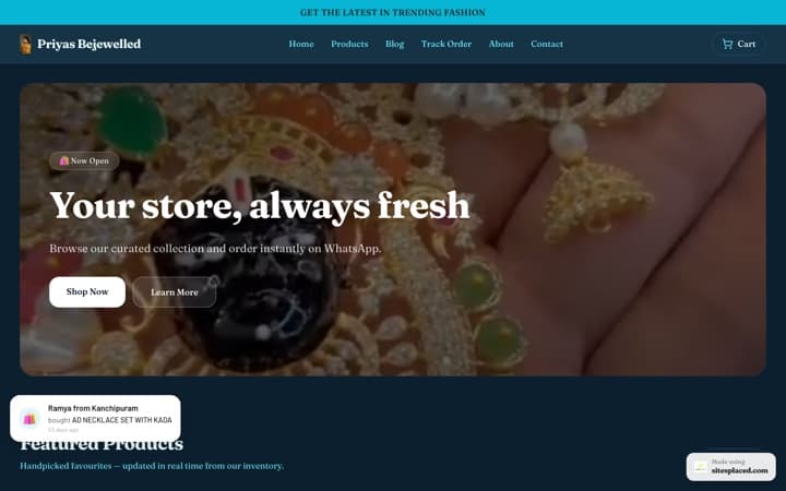
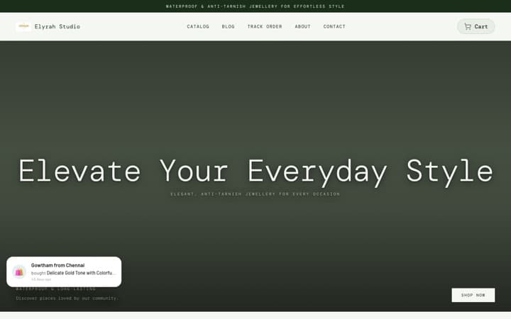
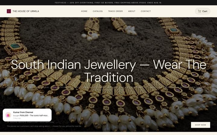
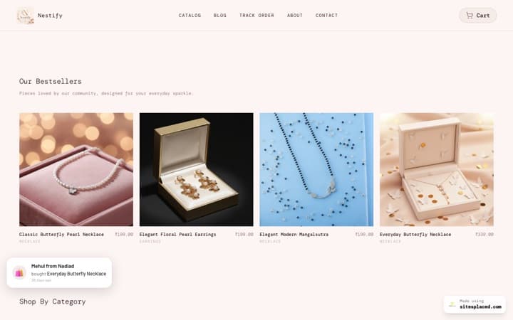
| Jewellery | GIVA | Helps people shop by budget | Jewellery Store |
| Electronics | boAt | Puts the spec and the deal where the eye lands | Electronics Store |
| Food | The Whole Truth | Sells with type and personality, not photoshoots | Food Store |
The brands are not involved with SitesPlaced. Each SitesPlaced template follows the layout of that brand’s phone site; your store uses your own name, photos and products. We do not link to the brands’ sites; search for them to compare.
1. Jnorss (clothing): show the size before the tap
- A clean white header with the name in the middle and thin icons.
- A full-width banner, then tall photo tiles for each category.
- Products in edge-to-edge rows of two, cards touching, tall photos.
- On each card: a red “Save %” tag on sale items and the sizes that are still in stock.
The lesson: a clothing shopper’s first question is “is my size there?” Answering it on the card saves a tap and a disappointment.
Get this layout: the Clothing Store, free on SitesPlaced. Add sizes as product options and the card shows only the sizes still in stock; set an MRP above the price and the save-% tag appears on its own. No banner yet? It fills the top with your own product photos. Open the showcase store to try it on your phone.
2. Troost (home decor): let big photos do the selling
- A solid black header bar with the logo centred.
- A full-width photo slider with numbered dots.
- Square category photos with the name written on the photo.
- A two-column product grid; cards show an “On sale” tag, a “From” price, the struck MRP and a star rating.
- A photo mosaic with a word on each photo, and one big statement line further down the page.
- On the product page, other designs in the same range shown as small photos.
The lesson: home goods sell on the picture. Calm spacing and big photos let a buyer compare patterns without reading a word.
Get this layout: the Home & Decor Store, free on SitesPlaced. The photo mosaic fills itself from your first categories, and when each design of a product has its own photo, the product page shows the designs as photos to tap. Open the showcase store to try it on your phone.
3. Bella Vita (beauty): make every card shoppable
- A thin black offer strip above a dark header that sits on the banner.
- Product rows behind two tabs: Bestsellers and New arrivals.
- On each card: a short benefit line, the star rating with the review count, and a full-width Add to cart button.
- A bundle-offer banner, and an offers box open on the product page.
- A small menu pinned to the bottom of the screen on phones.
The lesson: a beauty shopper decides on the benefit and the reviews. Put both on the card, with the button under them, and the home page becomes a shelf people shop from.
Get this layout: the Beauty Store, free on SitesPlaced. The benefit line comes from the product’s badges (for example “Long-lasting”), the Bestsellers tab is ranked from your real orders, and the bottom menu on phones is built in. Stars appear once you collect real reviews, which are on the Growth plan. Open the showcase store to try it on your phone.
4. GIVA (jewellery): help people shop by budget
- The logo on the left and a search box that is always open under it.
- Two rows of rounded category tiles you can swipe.
- “Shop by price” tiles, such as under a set amount.
- Dense rows of price-first cards.
- On the product page, each finish shown as a photo tile, with Buy now next to Add to cart.
The lesson: jewellery buyers often arrive with a budget and a type in mind, like “earrings under ₹1,000”. Search, category tiles and price tiles get them there in two taps.
Get this layout: the Jewellery Store, free on SitesPlaced. Shop-by-price tiles are worked out from your own in-stock prices, and when every finish of a piece has its own photo, the product page shows them as photo tiles. Open the showcase store to try it on your phone.
5. boAt (electronics): put the spec and the deal where the eye lands
- An offer strip with a coupon code at the very top.
- A row of category cut-outs above the banner, not below it.
- On each card: a “New launch” tag, a strip with one key spec across the bottom of the photo, and the discount.
- On the product page, coupon offers laid out as cards you can swipe.
The lesson: gadget buyers compare the spec and the price, then leave to check elsewhere. Showing the key spec on the card and the coupon on the product page answers both before they go.
Get this layout: the Electronics Store, free on SitesPlaced. The spec strip shows the first badge on each product, so add one like “50 hr playtime”. Coupon offers on the product page come from the coupons you choose to show. Open the showcase store to try it on your phone.
6. The Whole Truth (food): sell with type, not photoshoots
- A black strip under the header with the dispatch promise.
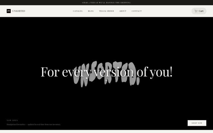
- A giant type headline where most stores put a photo.
- Big colour-block cards, one per category.
- Large product cards with the rating, the pack size and a full-width Add to cart that turns into a − 1 + counter.
- A small menu pinned to the bottom of the screen on phones.
The lesson: a food brand’s voice sells as well as its photos. Big, confident type costs nothing to shoot, and pack sizes on the card answer “how much do I get?” up front.
Get this layout: the Food Store, free on SitesPlaced. The headline is your own line or your store’s name, the category cards take your categories, and pack sizes come from your first product option (for example 250 g and 500 g). Add to cart turns into a − 1 + counter. Open the showcase store to try it on your phone.
What all six have in common
The layouts differ, but the buying steps are much the same. Across these sites you see add to cart from the product card, a buy button that stays in reach, delivery and cash-on-delivery details near the button, coupon codes shown where the shopper is deciding, bestseller rows and star ratings. We break down each one in the best-converting sales websites of 2026.
On SitesPlaced, quick add from cards, the buy bar on phones, the delivery and COD line, coupon codes on product pages and bestsellers ranked from real orders are free on every store template. Reviews and Buy X Get Y offers are on the Growth plan.
How to get the same layout for your store
- Pick your genre’s template. Clothing, Home & Decor, Beauty, Jewellery, Electronics or Food. Open its showcase store on your phone first. All 11 templates are compared in the best online store templates of 2026.
- Add your products the way the layout reads them. Sizes or pack sizes as options, an MRP when something is on sale, a badge for the spec or benefit line, and one photo per design or finish.
- Add one banner photo. That is the only picture the layout asks you for. Everything else fills itself from your products and categories.
- Fill in delivery and COD once. Dispatch time, free-delivery amount, COD and returns power the line under every buy button.
- Publish and share the link. Put it in your Instagram bio and WhatsApp catalogue. Your store is live at yourname.sitesplaced.com for free; your own domain is on Starter at ₹199/month.
FAQs
What are the best D2C websites in India in 2026?
Six that stand out on a phone, one per genre: Jnorss for clothing, Troost for home decor, Bella Vita for beauty, GIVA for jewellery, boAt for electronics and The Whole Truth for food. Each makes buying quick in a way that fits what it sells.
What is the best platform to build a D2C website in India?
For a small or new Indian brand, SitesPlaced. It publishes a real store free at 0% commission, with UPI, COD and WhatsApp checkout, and it has free templates laid out like each of the six brands above. Many large D2C brands run on Shopify with paid themes and apps, which suits a big team with a monthly budget; SitesPlaced gets a small brand the same layout without that cost.
Can I copy a brand’s website design?
You can follow a layout, which is what these templates do: where the header, categories, cards and buttons go. You should not copy a brand’s name, logo, photos or words. On SitesPlaced your store uses your own name, photos and products, and the brands are not involved.
Which template should I pick if I sell more than one kind of product?
Pick the genre most of your sales come from. A store that sells mostly clothing with a few accessories fits the Clothing Store; a mixed gift shop fits the Premium Store or the General Store. You can switch templates later without re-adding your products.
Do I need professional photos?
Clean phone photos on a plain background are enough to start. The Food Store leads with type rather than a photo, and the Clothing Store fills its banner from your product photos until you add one.
Your brand, laid out like the best in your genre.
Pick the template for what you sell, add your products and publish free, with UPI, COD and WhatsApp checkout at 0% commission.
Open my store free →